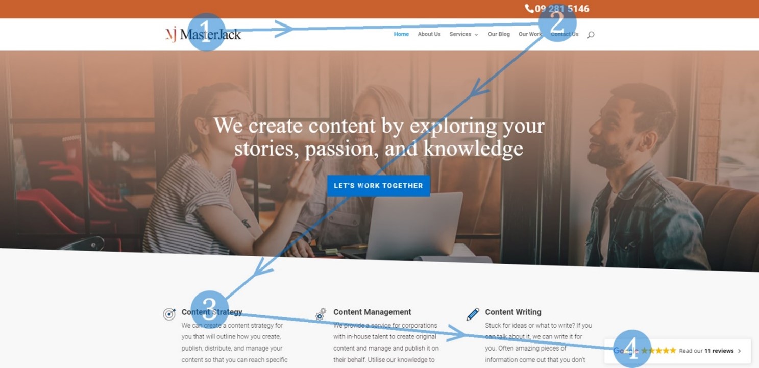
As “the eyes are the windows of the soul”, a website is a look into a business. A website with basic information and a phone number is no longer enough. You only have 10-20 seconds to connect with potential customers through a screen and convince them to keep reading.
I’m not going to tell you it’s easy, and there’s a lot that can be done, and likely not much time to do it. But I do hope you can implement something from this article that will help convert your readers to customers.
- Real estate on the page
- Content hierarchy
- Images – a thousand words
- Laying out the content
- Watch your language
- Features and benefits
- The call to action or the close
Real estate on the page
On a website page, the reader will first focus on the top left corner – this is why the logo/brand is usually located there. From there, the reader will read right and down in a Z shape.

The reader should be able to get an answer to their question without scrolling down or having to go through the menu. They want to know they’ve arrived at the right place (who you are, and what you do). This area of the website is called the most valuable piece of real estate on your website – which is often why there’s a banner slider to get across as many messages as possible in a short period of attention.
A dominant headline draws the eye, usually positioned at the top left. There needs to be a complete value proposition within the headline, and this is where clarity trumps persuasion. This is your chance to tell your target market what makes you better than everyone else. A template would look like this:
“For [target customer] who [needs or wants], our [product/service] is [category of industry] that [benefits].”
“For business owners who want their newsletters to reach their audience and provide shareable value.”
Because people read left to right, the left side of your web page gets more attention. Therefore, if you are selling products on your website, having upsells and cross-sells in a column on the left-hand side would be beneficial.
Should the reader have to scroll, ensure your website has a sticky menu, and then the navigation and branding will follow them down the page.
Content hierarchy
Content hierarchy is the strategic arrangement of information from most to least important. Back in the day, when I worked in newspapers, journalists would write stories just like that, with facts and information at the top, and the information would get less and less important as you kept reading. Then, when the editor laid out the page, the bottom of the story would get cropped depending on the available space. The same goes for website content; a person will scroll if they want to, but most likely, they’ll read what they want and move on.
It takes a viewer less than two-tenths of a second to form a first impression! They spend about 2.6 seconds scanning a website before focusing on a particular item. Then, 0.18 seconds of focus before moving on. It’s not long.
The average time spent on a website is 53 seconds. They’ll decide in the first 10-20 seconds if they will stick around. And if they do, it’ll only be for up to three minutes. Yep, all that work and effort for less than a minute of their time. But, if it’s done well, the return on investment will be worth it.
Images – a thousand words
Large, sharp images are best, even better if original rather than stock photography (originality counts towards Google’s algorithm). A low-quality image will turn people away from the page and site. Weirdly, readers prefer people who look ‘normal’ rather than good-looking – another reason to avoid stock images.
Have you heard the saying, “A picture is worth a thousand words.” Ha. If only that were true for counting how many words are on the page! But it does go a long way in conveying your message when you only get a second or two.

If there is a person in your imagery, ensure they are either looking straight ahead at the reader or towards the content on the page. If they’re looking away, they distrust the content next to them. Their body language is leading you off the page. I’ll put the same image of myself and Tori above further down in this article, and you’ll see what I mean.
Laying out the content
Ready to act reader.
In the first paragraph, get to the point. If the reader only has time to read the first bit of content, then make sure all the important information is in this paragraph, followed by a visible call to action without the reader having to scroll. It’s likely that this reader already knows about your business/service, wants to confirm they’re in the right place, and then contacts you. This is often an introductory paragraph and is bigger or bolder than the rest of the text.
Nearly ready reader.
If the reader has a little time, they’ll read the first bit, realise they’re in the right place, and then skim-read down the page before making the next step. The first paragraph is still important, but the rest of the content should be broken up with pull quotes, bullet points, videos, images, and social proof. Multiple headlines help; they will read on if the first words engage them.
Detailed reader.
The first paragraph is set, and the rest of the text is broken up. Now, even though it looks like they’re reading it all, they’re scanning – only 28% of your copy is read. People do scroll but put the most important content ‘above the fold’ – which is another newspaper term. If the story intrigued someone glancing at a folded-up newspaper, they’d pick it up. Similarly, if the information is positioned on the upper half of a web page, the viewer might scroll down to read the rest. Generally speaking, web pages should have a minimum of 400 words, and your main pages should be over 600. 800 to 2,000 words appear on pages that rank on the first page of Google.
Watch your language
At MasterJack, we are anti-jargon – it’s why we have ‘helpful jack’ on our website. If there’s a word you’re unsure of, then you can click on it, and an explanation will pop up. We also discourage our clients from using jargon; mortgage brokers might know what the triple CFA is, but a first-home buyer won’t, so you’ve lost them immediately because you made them feel a type of way. (It’s CCCFA, which is the Credit Contracts and Consumer Finance Act). So, using the everyday language of your target audience will make them feel comfortable with you.
It’s not easy; it’s a complex puzzle of knowing your audience and brand persona and then using a style that connects them online. I’ve written an article on the topic previously here that might help with style, choice of language and keywords.
But a quick tip is to keep the sentences short and in a single column. If you need to expand on something you’ve mentioned (commonly known as a rabbit hole), create a link and put it elsewhere.

Features and benefits
The idea is to sell whether you’ve got a product or service, but no one wants to feel like they’re being sold to. The goal is to connect with your customer’s problems and offer a solution. Most businesses can easily describe the features of their product/service; few dive into the benefits, but oddly enough, benefits are what compel customers to purchase.
Features are often technical, describing what the product or service does. Benefits describe how the product or service will change the consumer’s life in some way. Some examples;
Product: Headphones.
Feature: Wireless. Benefit: No more tangled cords.
Service: Law firm.
Feature: A small law firm that offers personalised customer service. Benefit: One-on-one attention.

And I want to point out that benefits for products are soooo much easier to come up with than benefits for services. A trick I learned is that you’ve landed on a benefit when you can no longer ask, ‘Which means you…’.
When I ask a new client about their unique selling proposition (USP), it’s often not unique. Answers like ‘we put our customers first’ or ‘we’re different’ are common answers. I have to ask ‘why?’ to get to the unique part, sometimes more than once. But that’s when the magic happens; we get to the story behind the why – and that’s what’s unique because no story is ever the same.
The call to action or the close
A call to action (CTA) is just that; it’s asking the reader to perform an action like calling, clicking a button, filling in a form, or making a purchase online. All CTAs should be simple and use an action verb (buy now, sign up, get started). They start getting fun when you start getting creative with them; for example, instead of ‘sign up’, you could put ‘take the leap’, or ‘view the demo’ could be ‘take a peek’.
Have you heard of ‘power words’? Salespeople use these, and I see no reason why you wouldn’t use them in your calls to action:
- You
- Save
- Results
- Money
- Time
- Guarantee
- Proven
- Exclusive
- Easy
- Now
If you have options for your product or service, then a proven method of increasing sales is to ensure it’s not a yes or no answer – give them options, then they’re not deciding yes or no, they’re deciding which one. The sale is done.
For example:
| Package One $1,000 | Package Two $2,500 | Package Three $6,000 |
| Interview | Interview | Interview |
| Article Writing | Article Writing | Article Writing |
| Upload to Website | Upload to Website | Upload to Website |
| Publish Newsletter to Database | Publish Newsletter to Database | Publish Newsletter to Database |
| Update Social Media Channels | Update Social Media Channels | Update Social Media Channels |
| Record Interview for YouTube | Record Interview for YouTube | |
| Record Interview for PodCast | Record Interview for PodCast | |
| Interview clients for Case Studies | ||
| Interview team leaders for profiles | ||
| Update website content |
Generally speaking, a reader will be considering the middle package; therefore, it should have a price point closer to the first package, so it’s not such a big leap. Also, it opens up the conversation to which elements of each package they are most interested in – then, you can offer customisable solutions.
If you have an after-hours reader or someone who doesn’t want to speak with you directly (yet), then forms are the best option. Also, most visitors likely come from a mobile phone, so ensure the form is fit for purpose. There will always be details you need to collect (like an email address) so that you can respond, but there’s no harm in getting clever with the options, just like in the CTAs.
Scratching the surface
I know there’s more, but I’ve already written over 1800 words on this, and I don’t want it to be overwhelming. Part two is coming next year! If you have any questions to make this more relevant to your business, feel free to have an e-chat (see what I did there?)
