Work we’ve done.
Websites
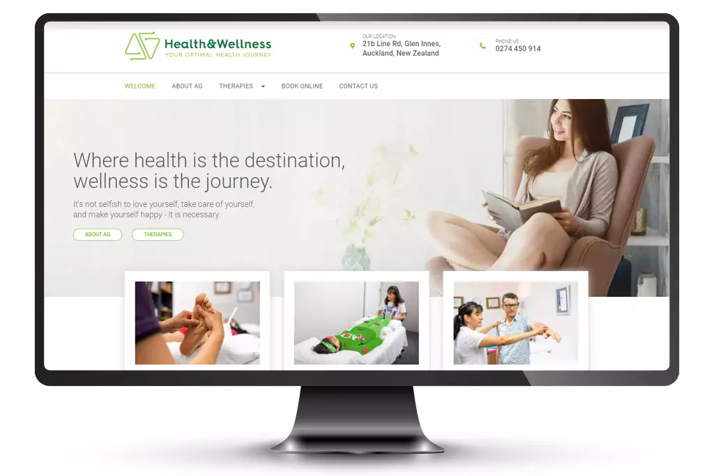
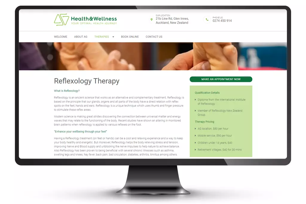
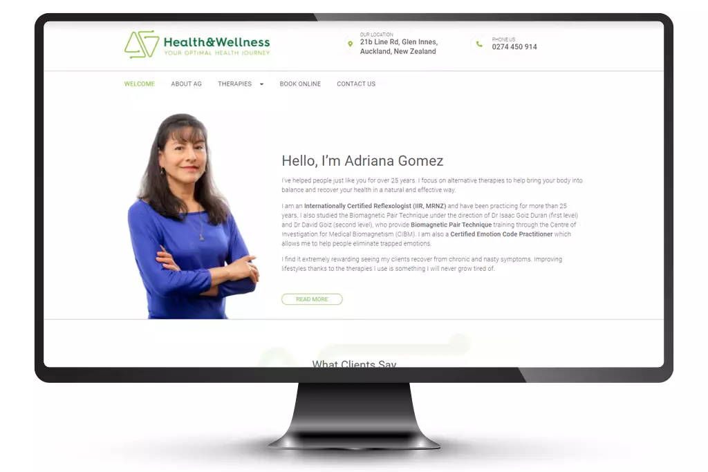
AG Health & Wellness
Adriana Gomez, from AG Health & Wellness, operates a home business and needed a healthier presence online (pun intended). The main goal was to drive interested readers to book an appointment and provide information and testimonials to diminish doubt and arouse curiosity. We guided Adriana through the process of setting up a domain and emails with her existing suppliers, then we redrew the logo in various formats for design, print and online use.
We created a simple design that Adriana could add to herself. A home page with banner sliders, feature boxes to entice the viewer further into the site, and introducing Adriana herself. A follow-on template for the treatments with information and FAQs. We also ensured that there were call-to-actions throughout the site to encourage contact and bookings.
The site is mobile responsive and stacks for viewer engagement. YouTube videos can also be added by Adriana without having to return to her developer each time she wants to add or make a change.
East Care
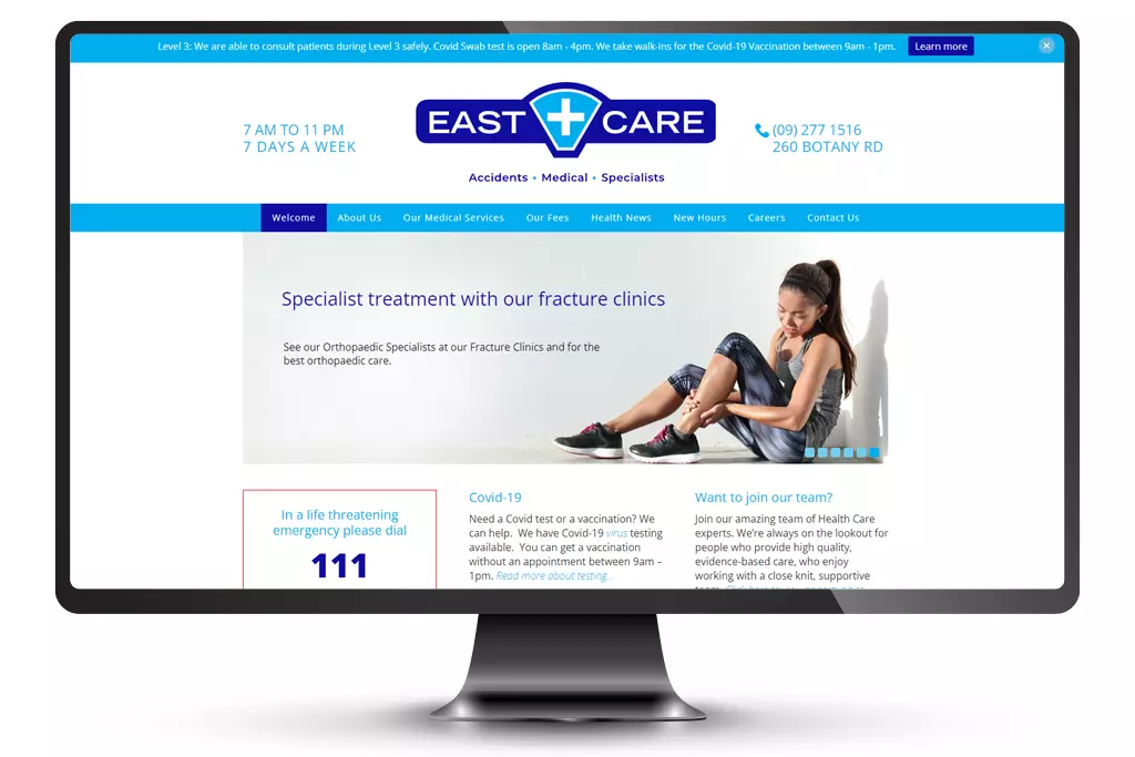
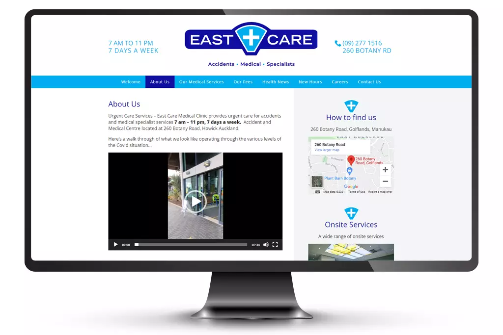
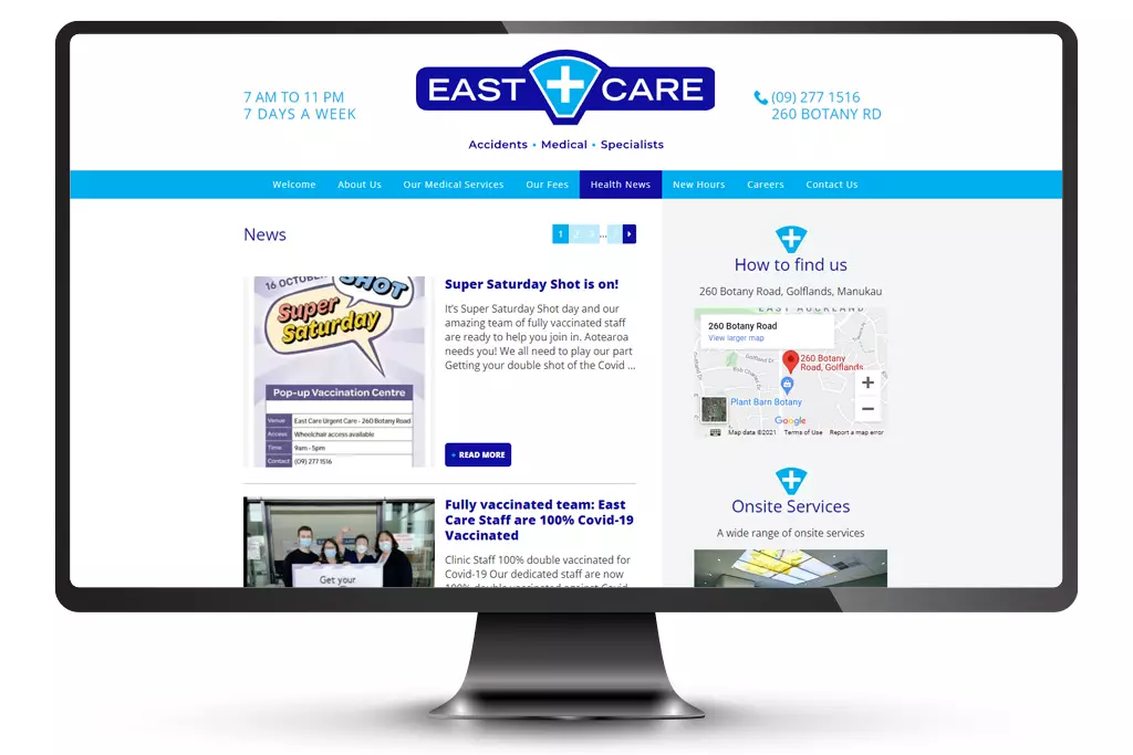
East Care is in Botany, Auckland, and had been a client of ours for ten years before gaining in-house marketing support. During this time the messages to the community change with what’s going on in the world – but the thing that remains constant is their dedication to providing the local community with urgent accident and medical care, seven days a week.
We have helped them to relaunch their social media presence, updated the website on a regular basis with new content, organised photography, and created local campaigns to promote their services and community care opportunities.
Their first website was developed using WordPress and it was so easy to use that we refreshed the front of the website five years later which has stood the test of trends and time. They need to be able to communicate quickly and effectively – so the home page banner slider gives them an opportunity to get multiple messages across in one space. These then click through to their news pages which give the viewer more information.
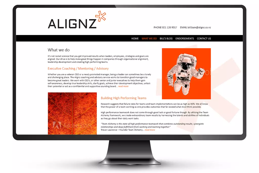
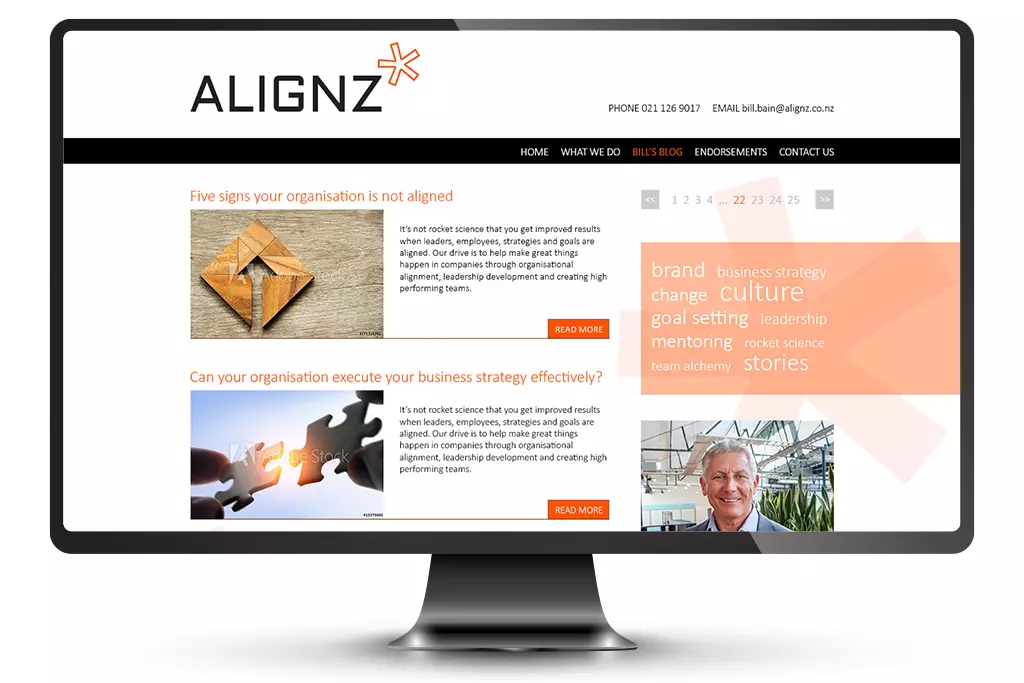
ALIGNZ
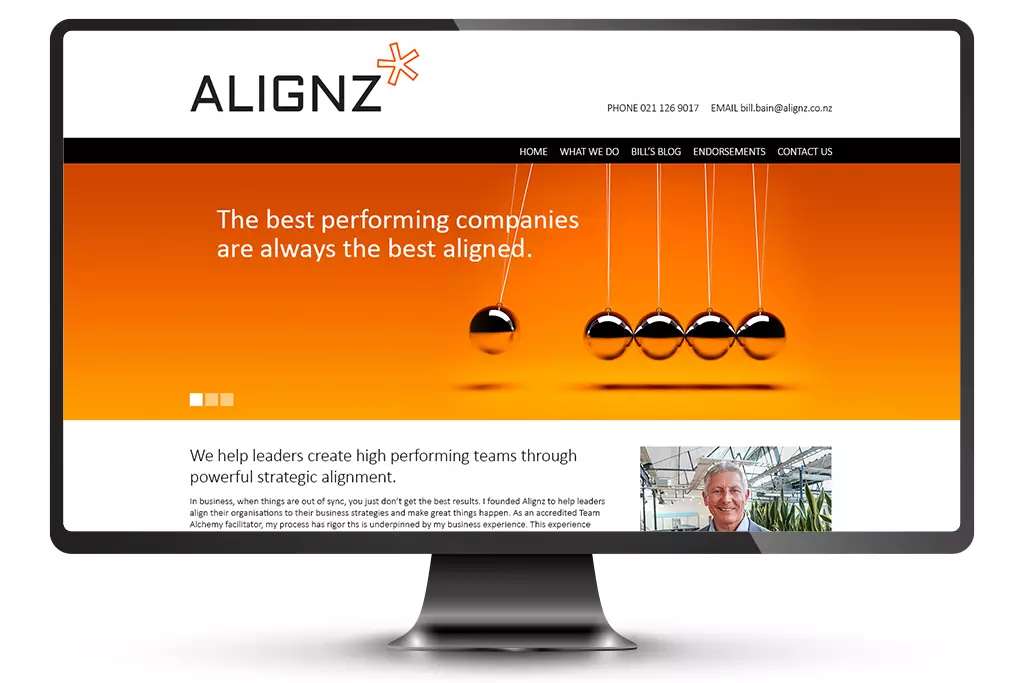
Bill Bain provides executive coaching for leaders and teams. He founded Alignz under the premise of helping leaders align personal thinking to actions and behaviours. His style is genuine and challenging, resulting in clients going further than they imagined.
Bill needed a website he could update himself by adding regular thought pieces to increase his profile. These would be put on his LinkedIn and would link to his website to read the full article.
As Bill’s time is intermittent to be able to work on his own business (like most business owners and start ups), we set up a temporary website using a basic WordPress template which will fill the gap until the site we designed can be developed.
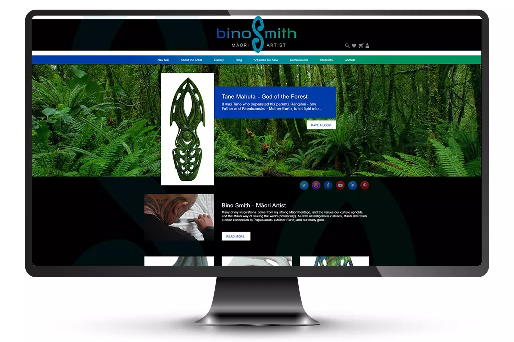
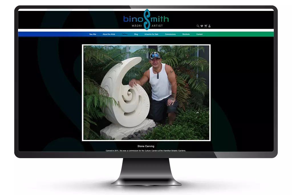
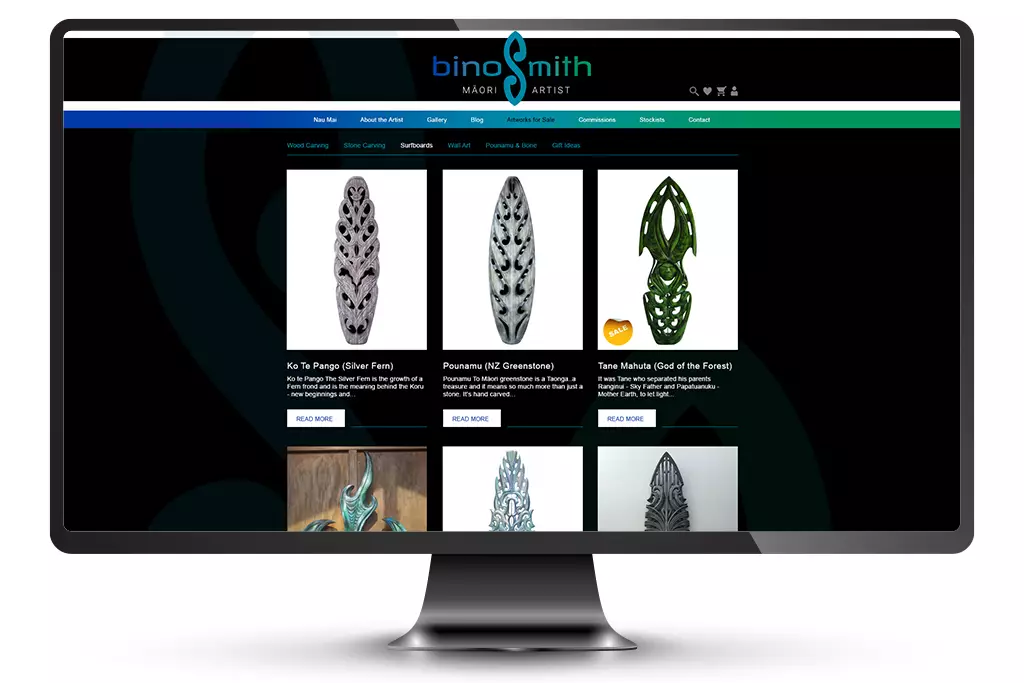
Bino Smith
Bino Smith is an amazing multi-medium artist and one of the most interesting people we’ve had the pleasure of working with. A talented drawer, painter, carver, Lord of the Rings trilogy and King Kong set worker, Bino has stories from all over the place. The brief began with wanting to set up a website to sell his work online.
We designed a logo and used it across social media, business cards and brochures for an exhibition in America. The ‘S’ represents the surfboard carvings he is famous for – in New Zealand and overseas. When it came to the website, we used WordPress with a Woo Commerce and Stripe plugins for the shopping experience. The site ships to New Zealand, Australia, and the United States.
To keep the site easily updatable, we included an automatic feed from Facebook to the page as this is Bino’s most comfortable social media channel. We provided a basic manual with step-by-step instructions on how to update the products, pricing, shipping, blog, gallery, and content in general.
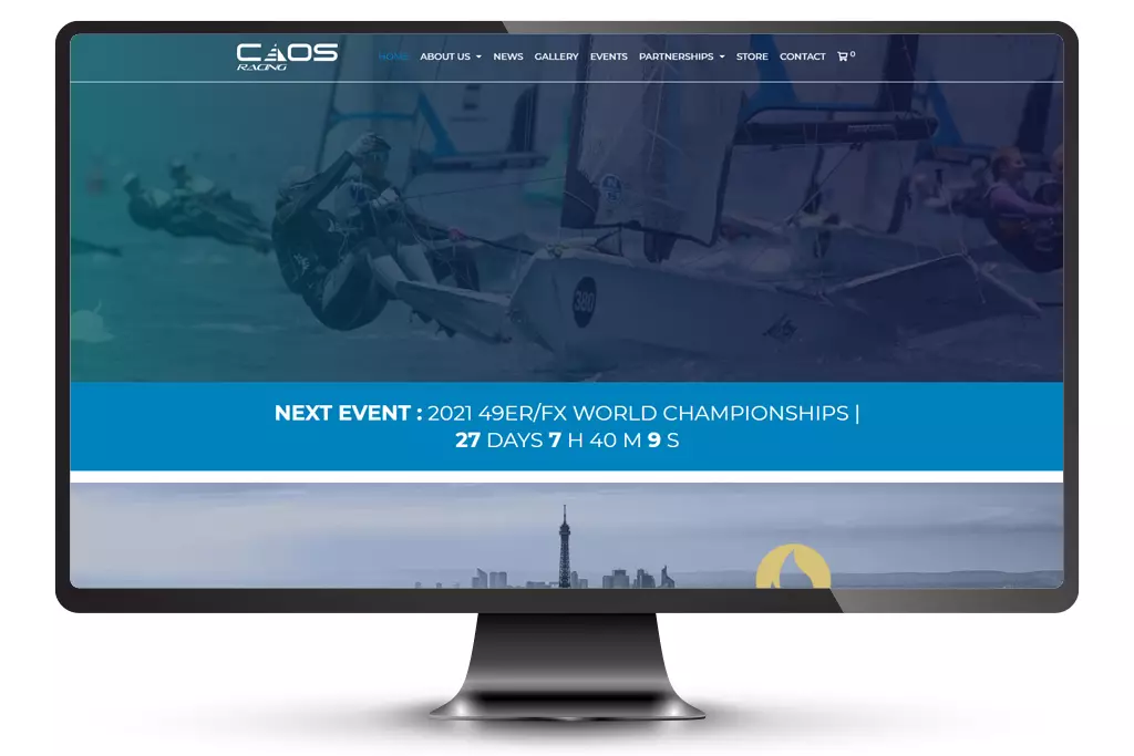
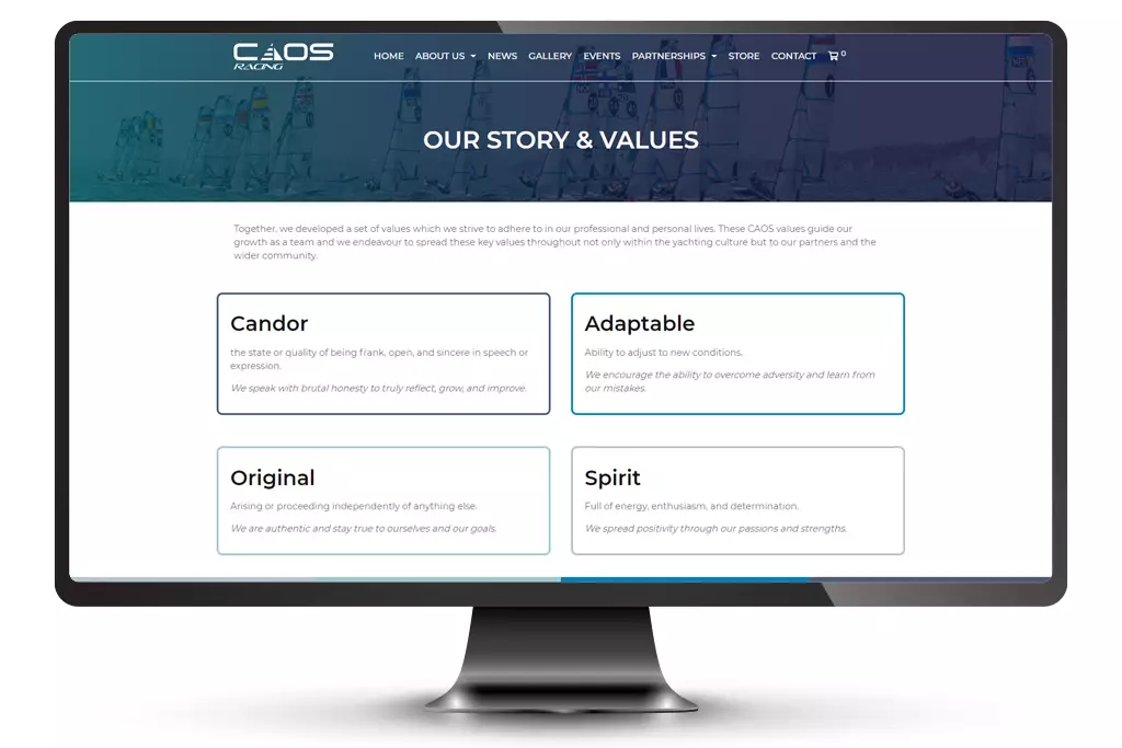
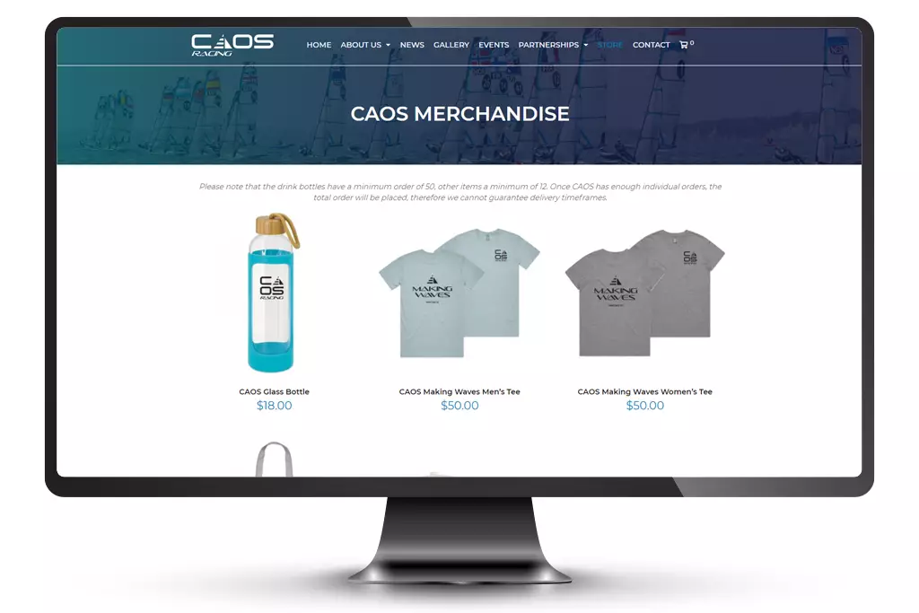
CAOS
Crystal and Olivia are two amazing young women who are on the road for the Paris 2024 Olympics in the sport of sailing 49er FX. They needed a brand and a website that would give them online profile to be able to attract sponsors. Their tagline “making waves” represents their aspiration to standout from others and make a difference.
We walked with the girls through creating their values; Candor, Adaptable, Original and Spirit (CAOS) which is also their names (Crystal And Olivia Sailing). We began by helping them create a plan around fundraising – through them hosting businesses on the harbour and commentating on the America’s Cup held in Auckland. Plus we developed their logo into a brand that could be printed on merchandise for sale – another way to raise funds for their competitions and ultimate goal in France.
The website uses WordPress so that the sailing team can keep the site updated themselves, and WooCommerce was installed so that they can sell their merchandise online.
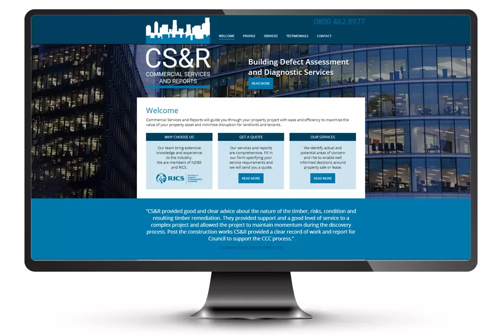
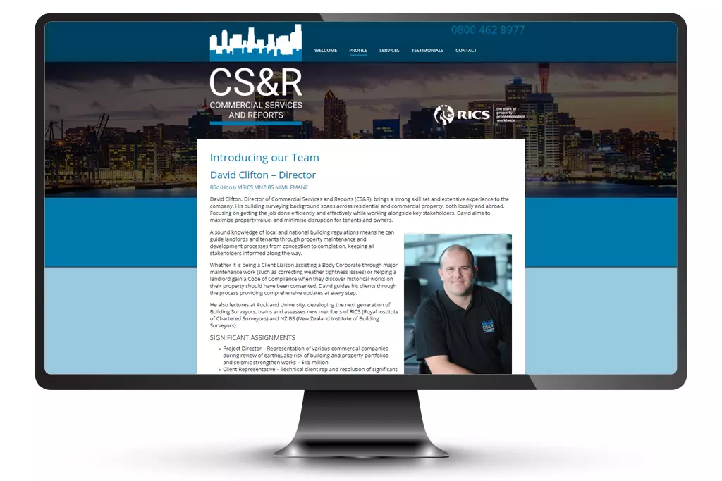
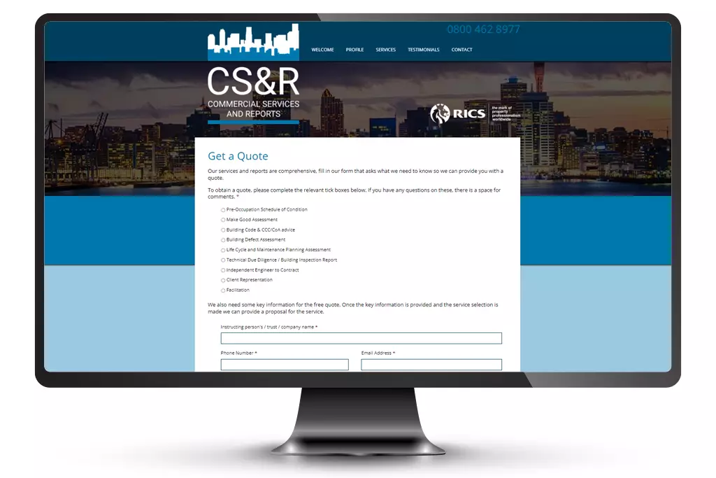
CSAR
David Clifton is one of the most highly qualified and experienced surveyors in New Zealand. With two businesses, one in the residential market and one in the commercial, David’s sound knowledge of local and national building regulations make him the go-to specialist for property assessments.
David had a name in mind for his commercial business: Commercial Report and Services. We pointed out that the acronym would then be CRAS and suggested moving the letters around. We landed on Commercial Services and Reports – CSAR. A small detail, but one worth noting in David’s opinion.
We designed the logo for CSAR and created business cards for David. As a celebration of his new commercial arm, we branded some promotional products for him to give to potential clients.
We created two websites, refreshing the existing one for residential and designing and developing one from scratch for commercial clients. They both use WordPress and using the Gravity Forms plugin, we created questionnaires to help speed up the quoting process for both the business and the customer.
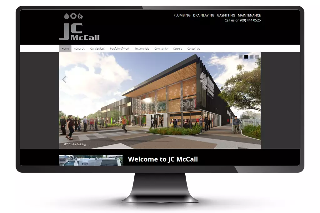

JC McCall
Clare McCall from JC McCall have been clients of ours for many years now. Subcontracting to the big developers, JC McCall provide high quality plumbing, gas fitting, and drain laying solutions for some of the biggest names in commercial and residential construction.
They also champion a charity Himalayan Leaky Foundation serving those with less in Nepal for which we help with their newsletter and social media marketing.
We have designed and developed the JC McCall brand twice during this time, going from business to business with a multi-coloured brand, and then maturing to business to corporate with a chrome finish.
This has entailed updating logo files, building signage, vehicle signage, stationery, Google AdWord campaigns and website design and development. The current website uses WordPress which showcases an impressive portfolio of work and the opportunity to advertise career opportunities.
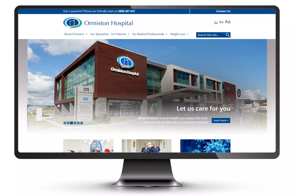
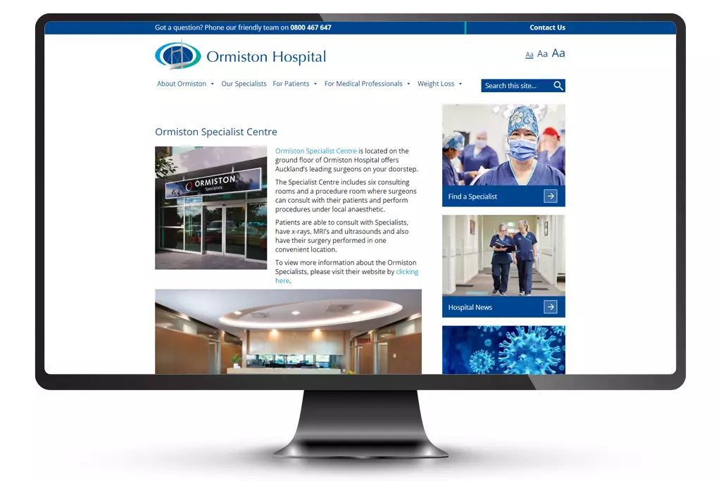
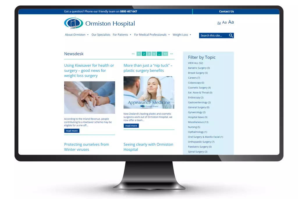
Ormiston Hospital
Ormiston Hospital’s vision is to be the preferred private surgical hospital for the East Auckland community through clinical excellence and superior service.
Onsite they have a specialist’s centre, pharmacy, physiotherapy, and a café that abides by the philosophy that food helps people achieve an optimal state of health and wellbeing.
In 2018 we were invited to submit a proposal for their new website. After a few meetings and genuinely connecting with the team, we designed and developed a WordPress website that could grow with their available time and budget allowances.
The site has two main sections – one for patients answering every possible question and explaining processes for ease of mind, and one for their medical professionals which attracts the country’s leading surgeons.
Design, print and promotion
LockSmart
Jono and Nicola needed a logo, and we were only too happy to help. We looked at who their competition was and the market they were trying to attract, and came up with a retail-looking brand.
By providing various file types, they have gone on to develop their own website, shop signage and vehicle wraps. The same blue and same red is used throughout because of the colour breakdowns we supplied – this makes for consistent branding which adds strength to it.
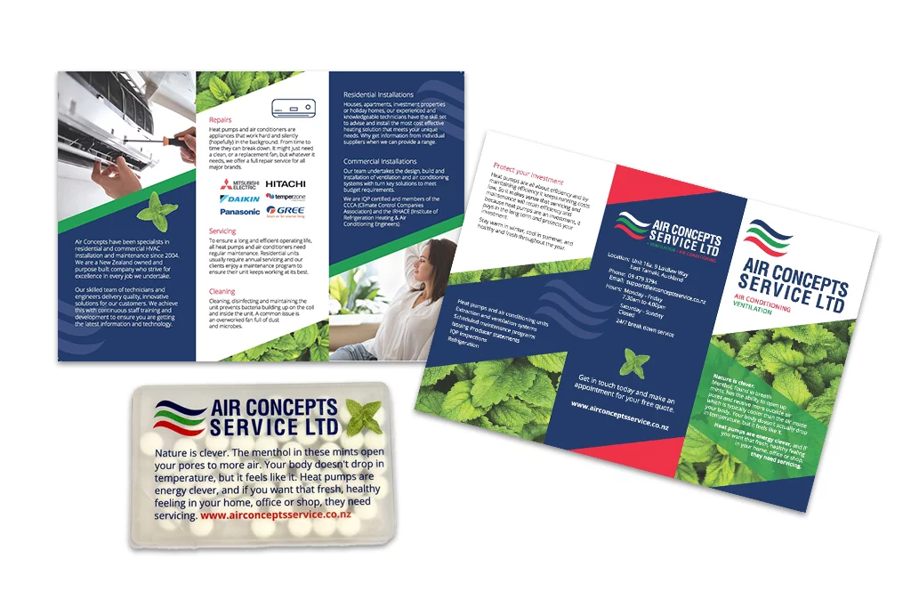
Air Concepts
Doc from Air Concepts came to us with a problem, how do we target our local community to get more servicing work for heat pumps?
We came up with a “spray and pray” campaign plan working with his team. They would go door-knocking and drop off a brochure and a packet of mints, follow up with a phone call a couple of days later and book a time to come and quote.
The mints were a giveaway so that the brand and reminder would stick with them. We likened the mints to the heat pumps with a story. Zoom in and have a read.

Sales Mastery Programme
Ambrose gave us a copy of his existing brochure and asked what we would do with it. We studied his programmes and converted the content into simple text and graphics.
“This is the best brochure we’ve ever done in 17 years!”
Originally a printed item, we’ve created a PDF brochure small enough in size to be emailed to anyone asking for information about the courses. It can be converted into a print file as well, but during the various lockdowns and with international clientele, we recommended this as the best publishing option.
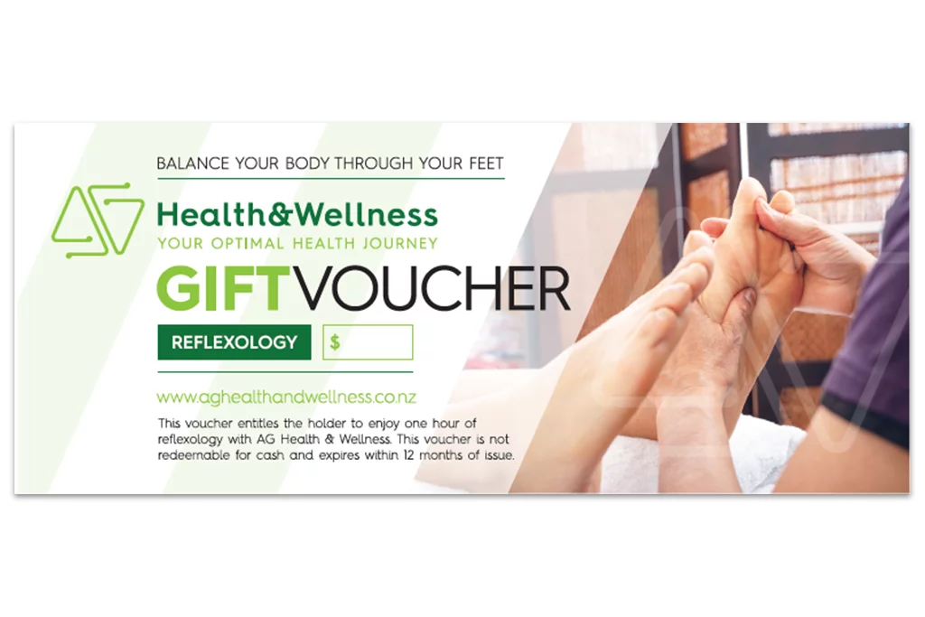
AG Health & Wellness
Adriana needed a voucher that could be printed at her home office. We took her existing logo, asked all the right questions, checked out her online presence and came up with a design that was approved straight away.
We made the voucher flexible – customers can choose the amount they want to spend, and we provided a file that had three on an A4 page that Adriana could print and manage herself.
We’ve enjoyed the working relationship so much with Adriana, we have gone on to design and develop conference brochures and a new website.
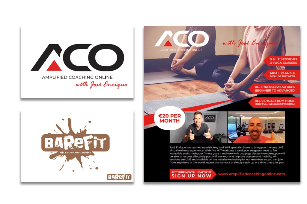
ACO
Steve from Barefit is an existing client, we’d helped him to recreate his logo so that he could use it for various applications. Now he was beginning a project with ACO and partnering with soccer player Jose Enrique.
We developed some logo options and the one you see is the one he ran with. We then developed some online international advertising for various demographics. We paid close attention to the call to actions and promoting their unique selling points as well as using smiling faces to create familiarity and comfort.
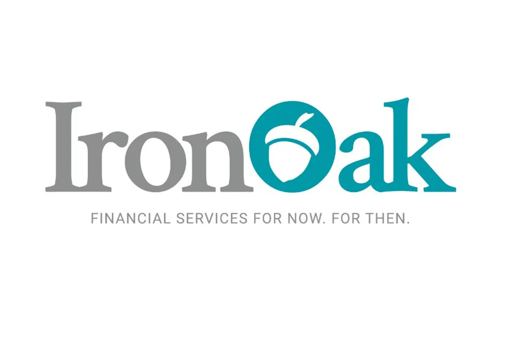
IronOak
Daniel came up with a clever name for his new insurance business. His surname Smithwood became IronOak. It needed to be strong and simple. We also worked with Daniel on his tagline. Insurance is something you need now to ensure you’re covered for when it happens.
Once a concept was chosen, we developed a basic brand guideline – a one page document that shows what the logo looks like on a black background, white background or when the logo can only be used in one colour. It also provides a breakdown of the colours used for printing and computer screens.
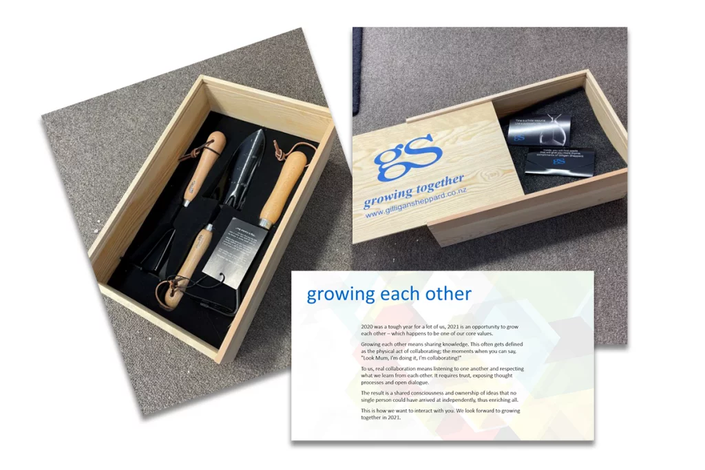
Gilligan Sheppard
When Gilligan Sheppard wanted to love on their clients, we came up with an idea that focussed on one of their values “growing together”. We sent them a box of gardening tools and some Thyme seeds.
The messaging was around growing each other through the difficult times. Collaborating to create ideas that no single person could arrive at on their own. That we were all in this together.
The seed packets had messaging around creating time and so the Dad joke humour came through. They received awesome responses from their clients and will now make this an annual happening.
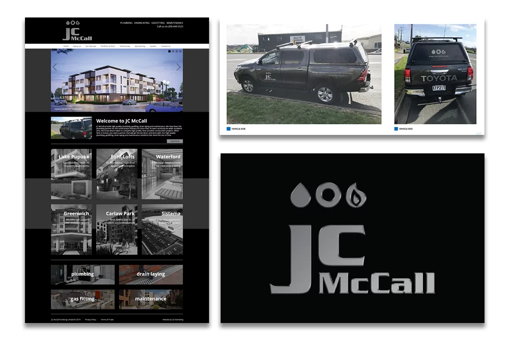
JC McCall
Clare and her team have been clients of ours for many years and when the time came to refresh the JC McCall branding, they had no hesitation in tasking it to us. As they are predominantly sub-contractors, we matured the brand and did away with the multi-colour retail look.
From brand development through to stationery, email signatures, website, location and vehicle signage and a new website, we worked to keep the brand looking polished. Whenever they need some more letterheads or business cards, we sort it out with one email.